MATS icb 2023: the last week - cover design and recap
The year has nearly come to an end, and I am trying desperately to finish up some of my work to-do’s. November and December were full of sick days and holiday preparation, so I didn’t get as much done as I would have hoped for. But anyway, I am finishing off my series on the “Make Art that Sells” Illustrating Children’s Books-Course with the final part. Week 5 was cover week and I also managed to revise my other pieces.
If you want to read everything from the beginning, I suggest you start here:
1. Can I illustrate a Children’s Book?
3. About Disappointment and giving myself a little more Grace
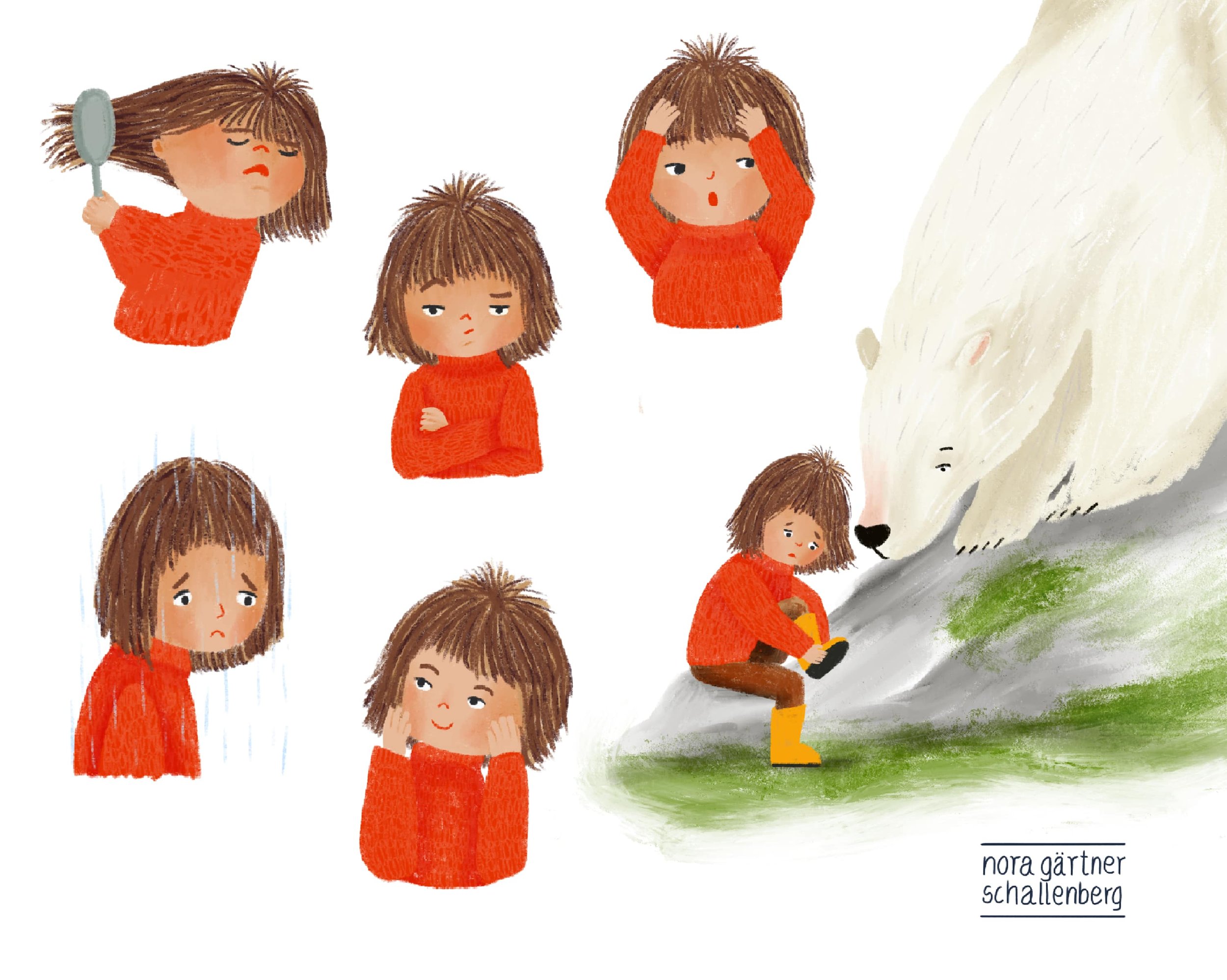
4. Expressions and Emotions - Mine and my Characters
Practising my hand lettering
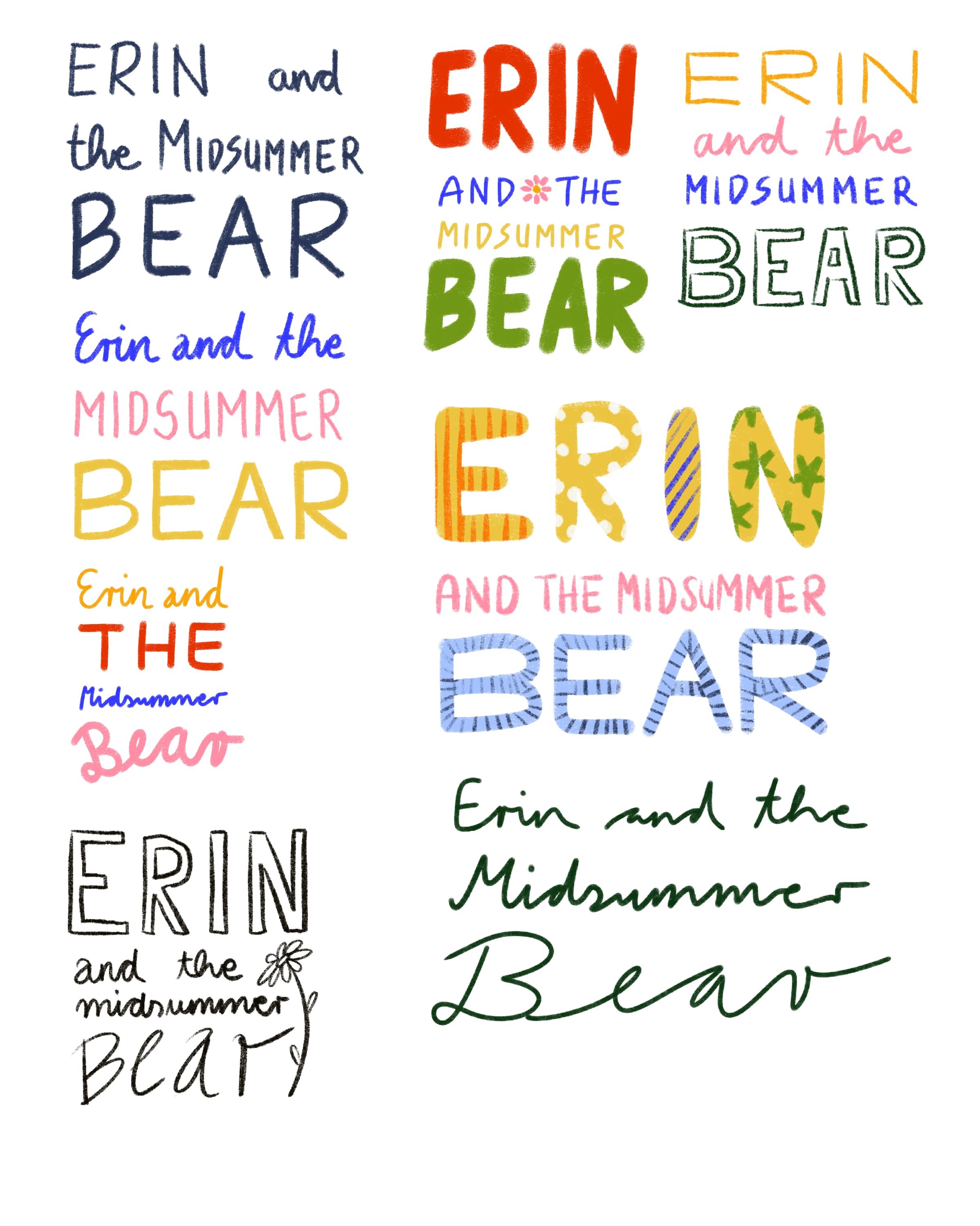
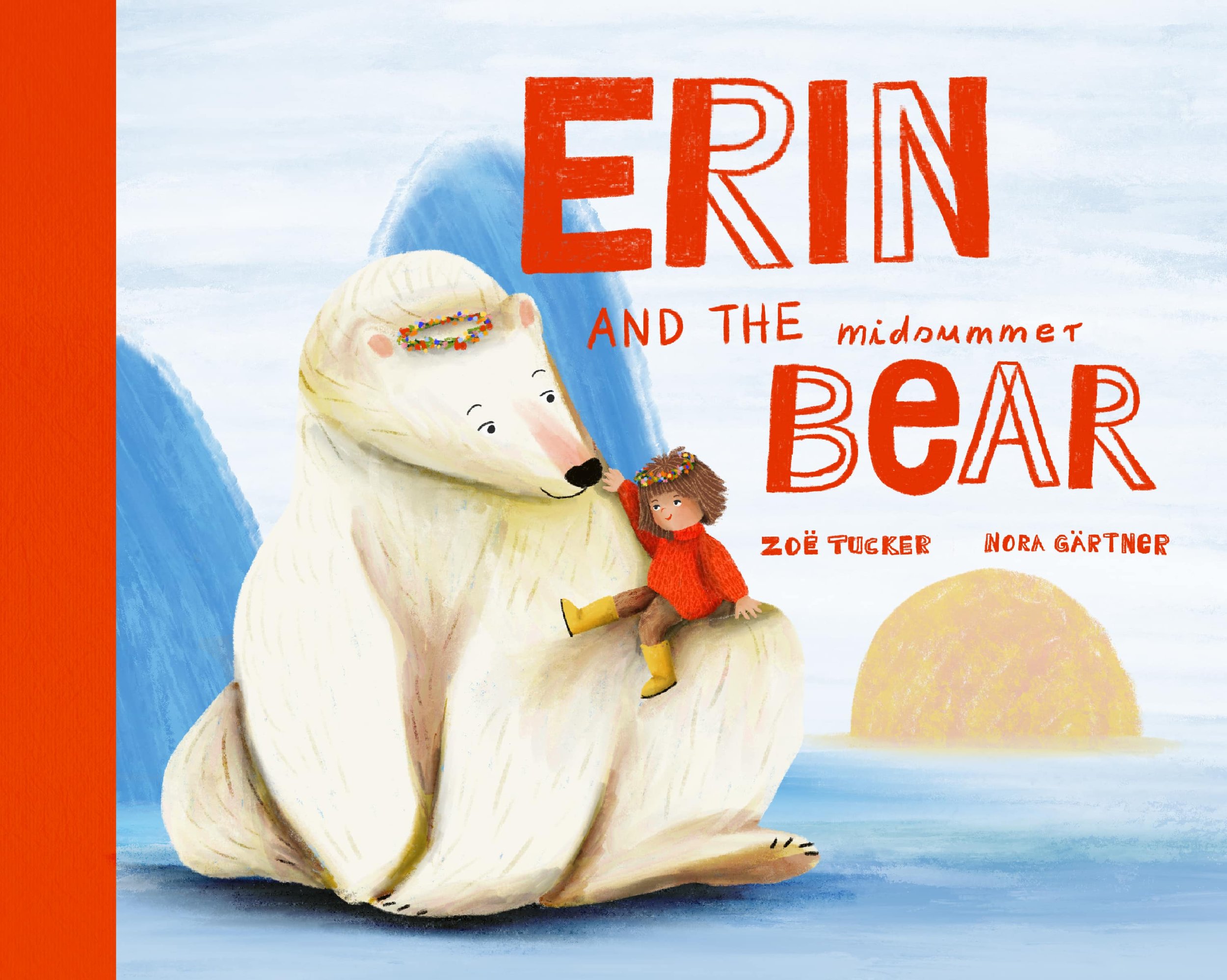
I was pretty sure from the beginning that I wanted to use hand lettering for the cover. So I tried a few different versions of the title. Using a font would have been easier, but I quite like the feeling of a hand drawn letters, and it felt fitting for this story and the style I had in mind.
Creating a cover from scratch
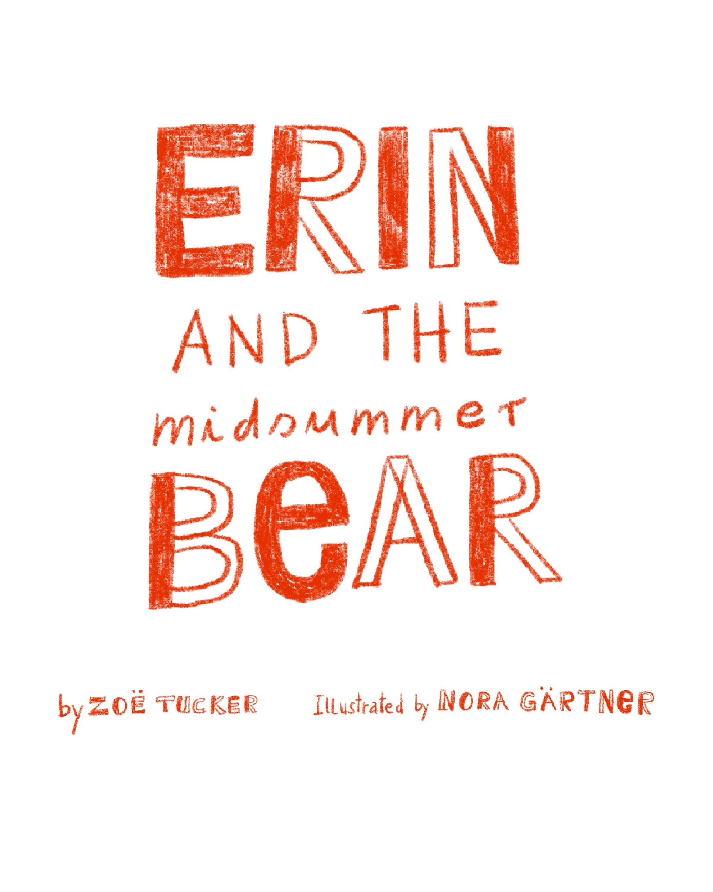
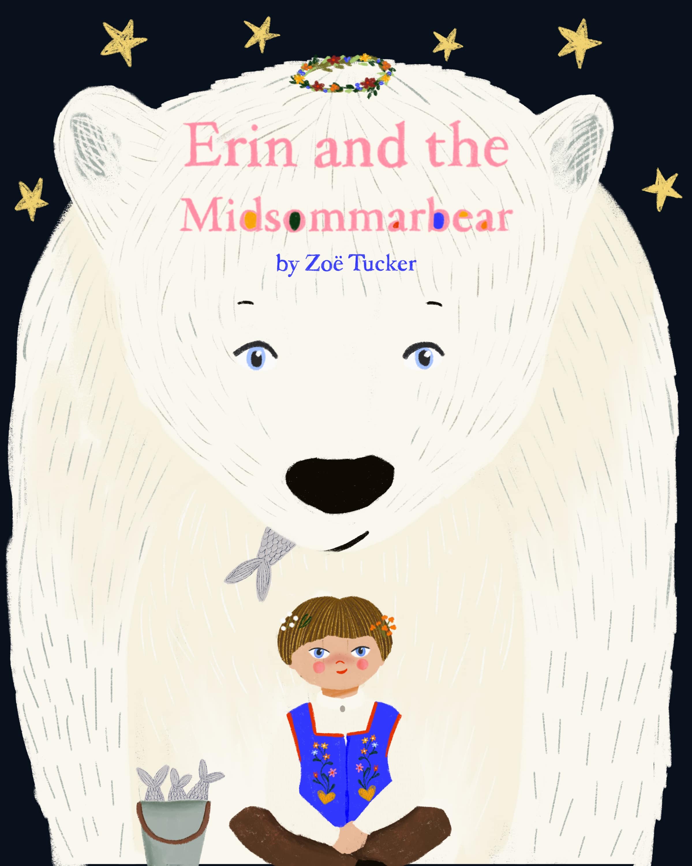
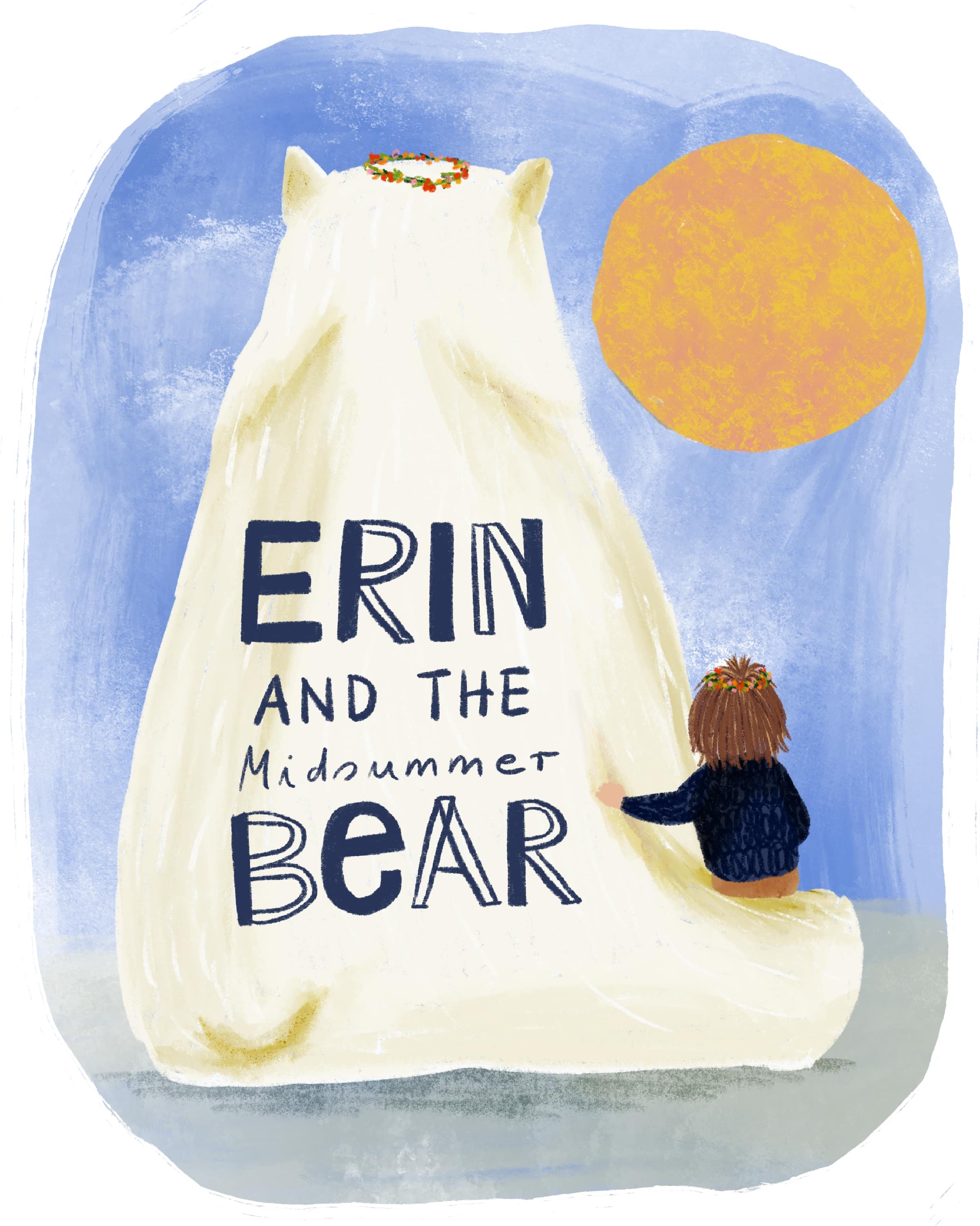
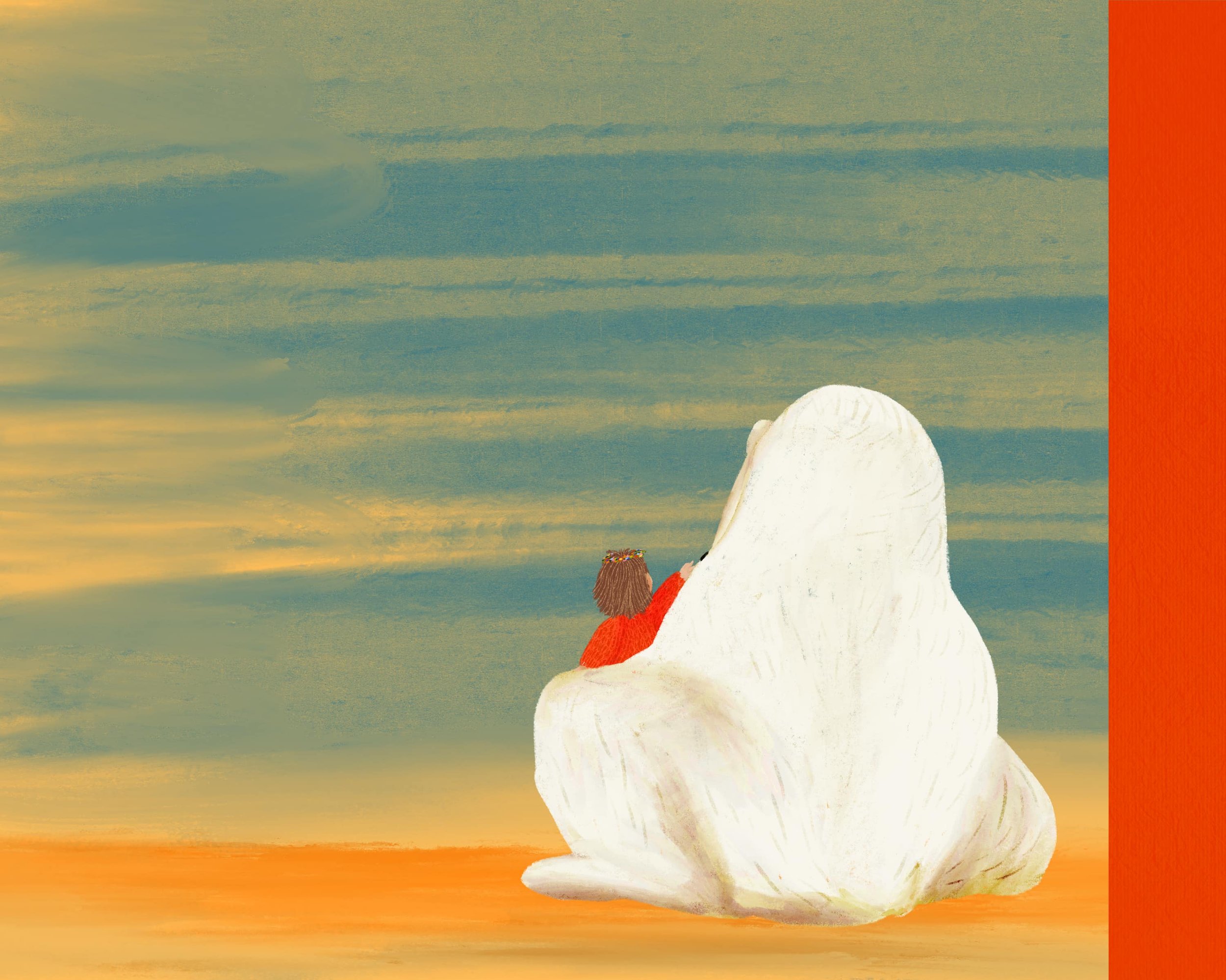
Below, you see all the vertical cover designs I came up with. The first one was based on a very early version of Erin and the bear and I made it when I started the course, because it just popped up in my head. The idea for the other cover design was also in mind as soon as I started to work on the lovely story. That means, I carried this in my head for the entire five weeks. When I finally realised it, I loved it, but it bothered me because it was a vertical cover and I had worked all the pages with a horizontal layout in mind. You can already see that I developed several versions of the cover colour-wise, and it got worse with the final design 🙈.
Coming up with the final design
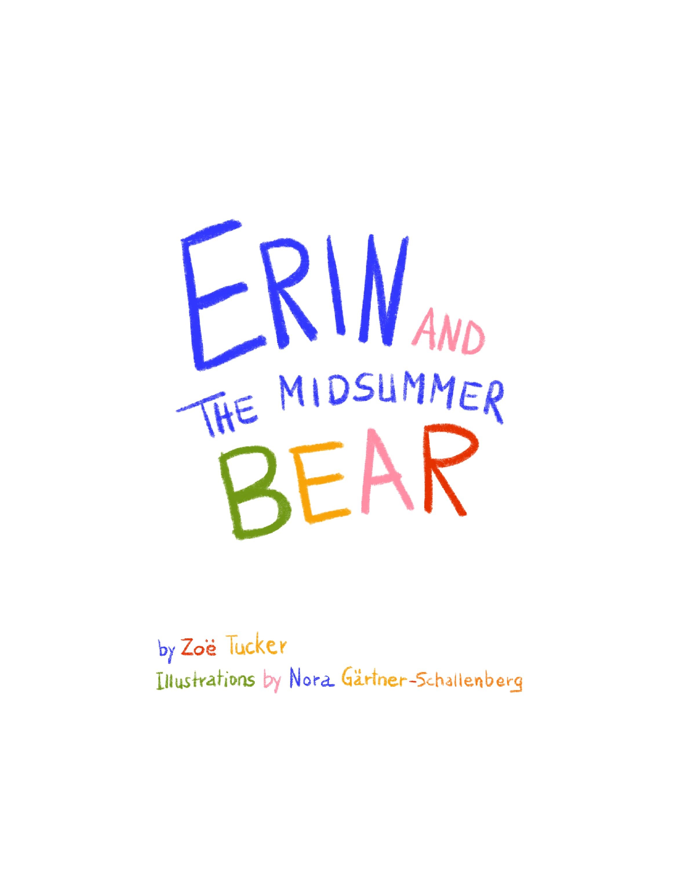
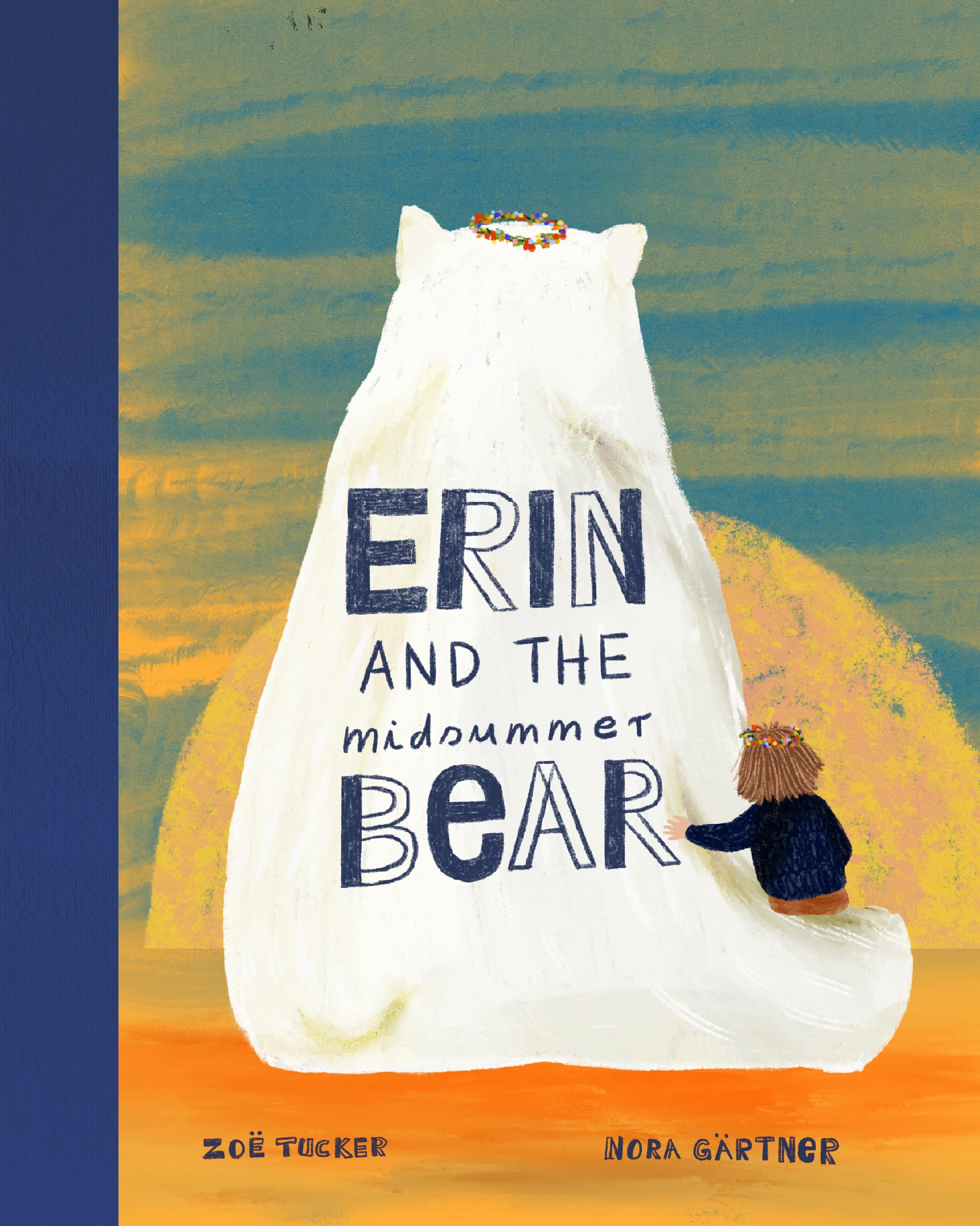
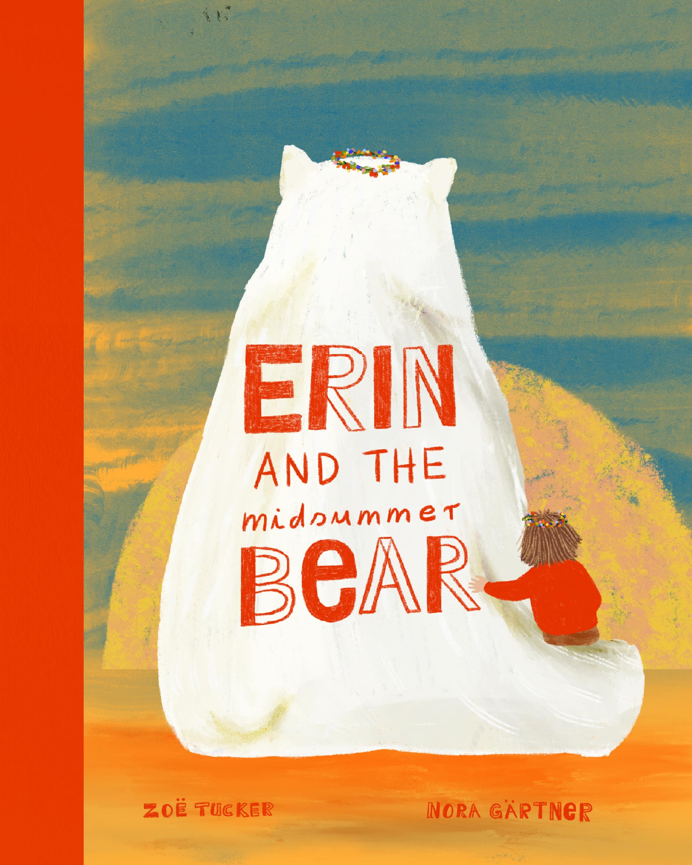
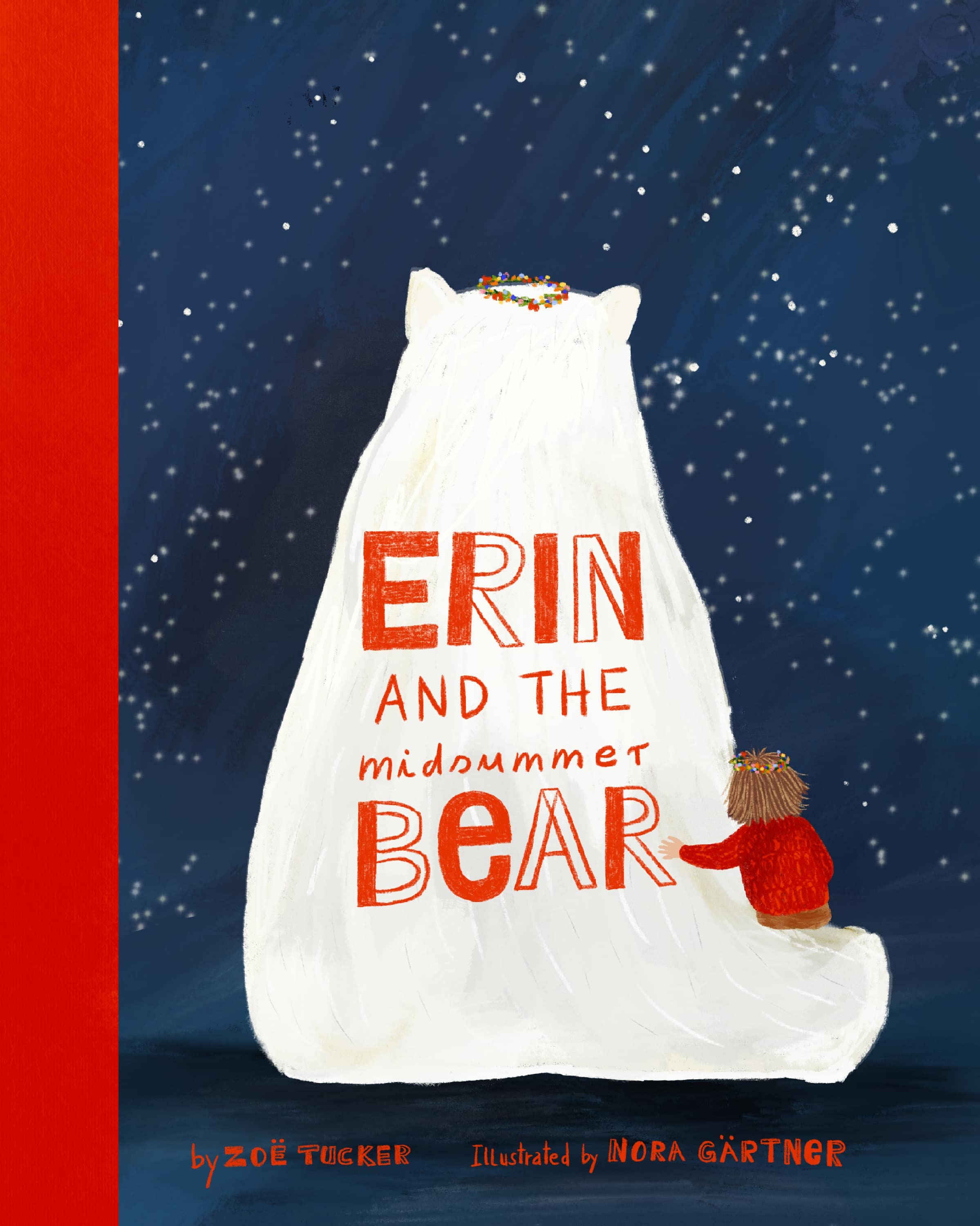
As much as I loved this cover, I started to think about a horizontal one, that would be a better fit, for all my other page designs. I finally decided to turn Erin and bear around, but to leave the option of the back view for the back cover. This is the final layout I came up with, which I tried in a gazillion different colour-ways and variations (which made it so much easier to decide…..NOT).
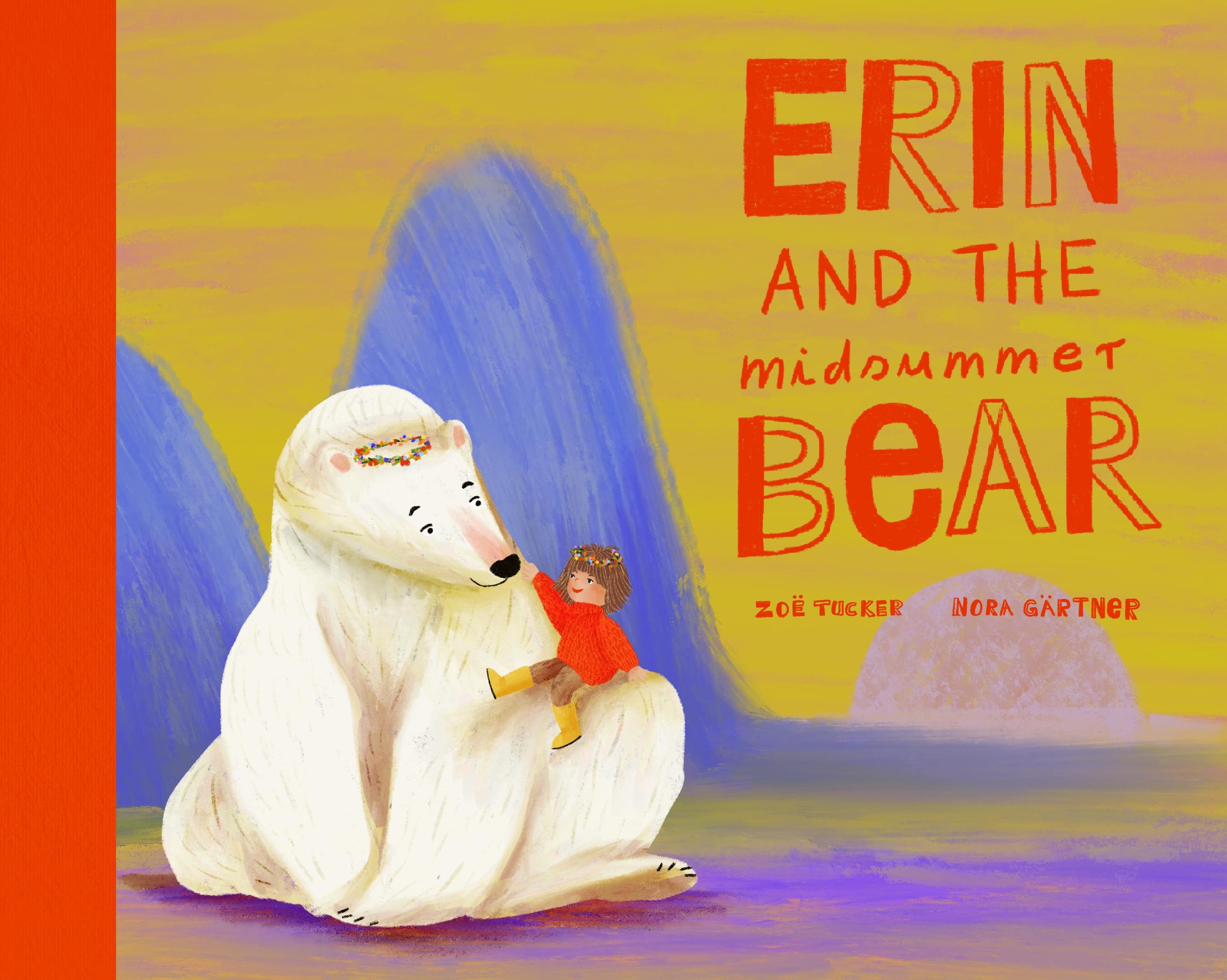
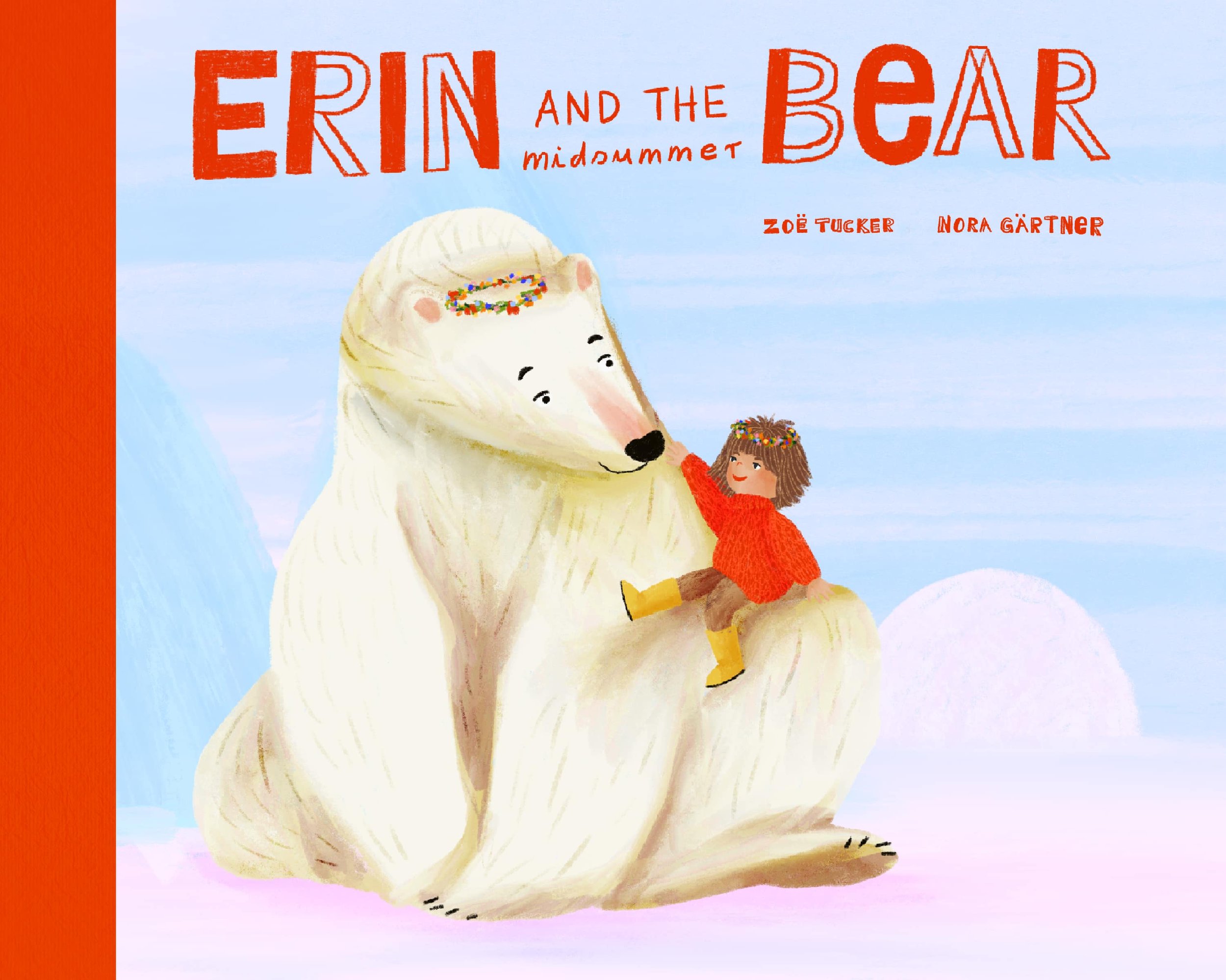
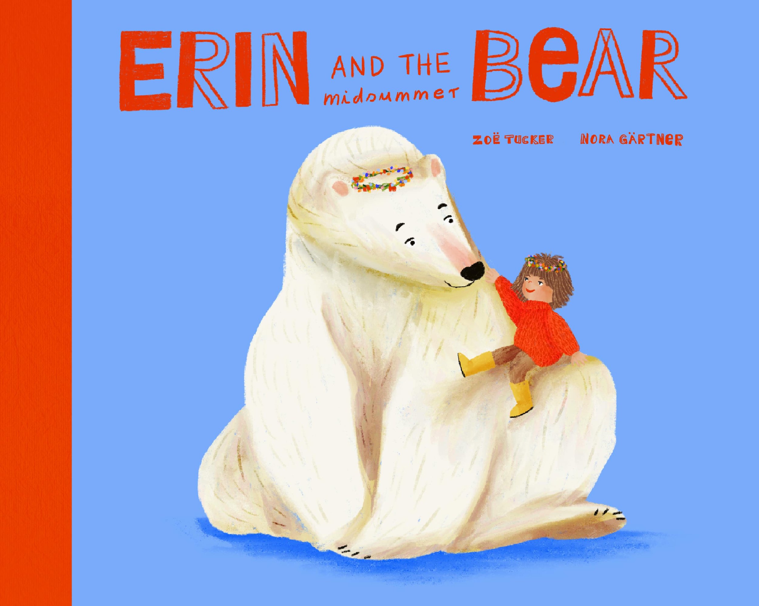
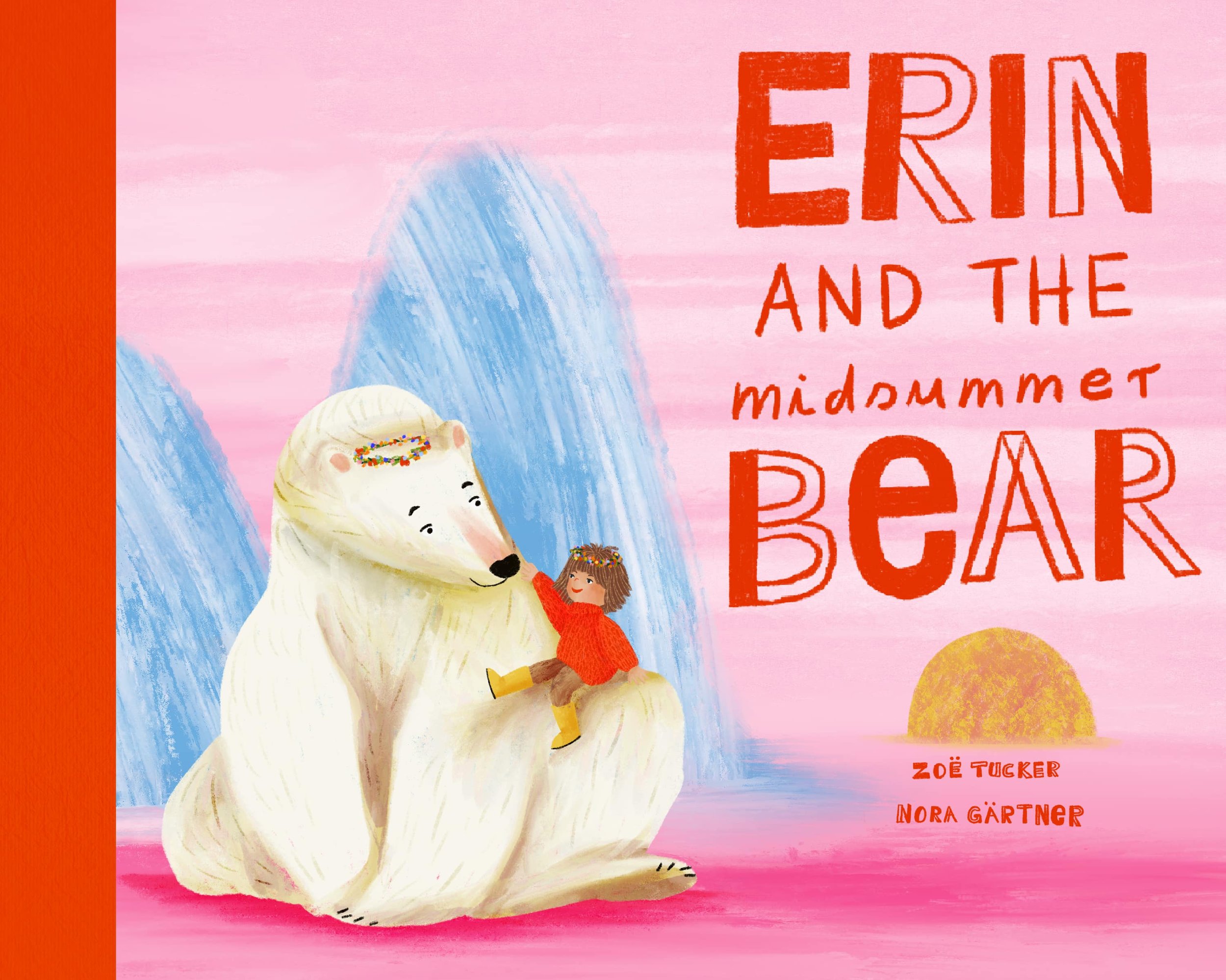
It was more difficult than I had thought to find the right balance between text, colours, saturation, readability and character size. I finally settled for a bluish colour, which went with most of the other illustrations. But I kept the red spine cloth because I really like that.
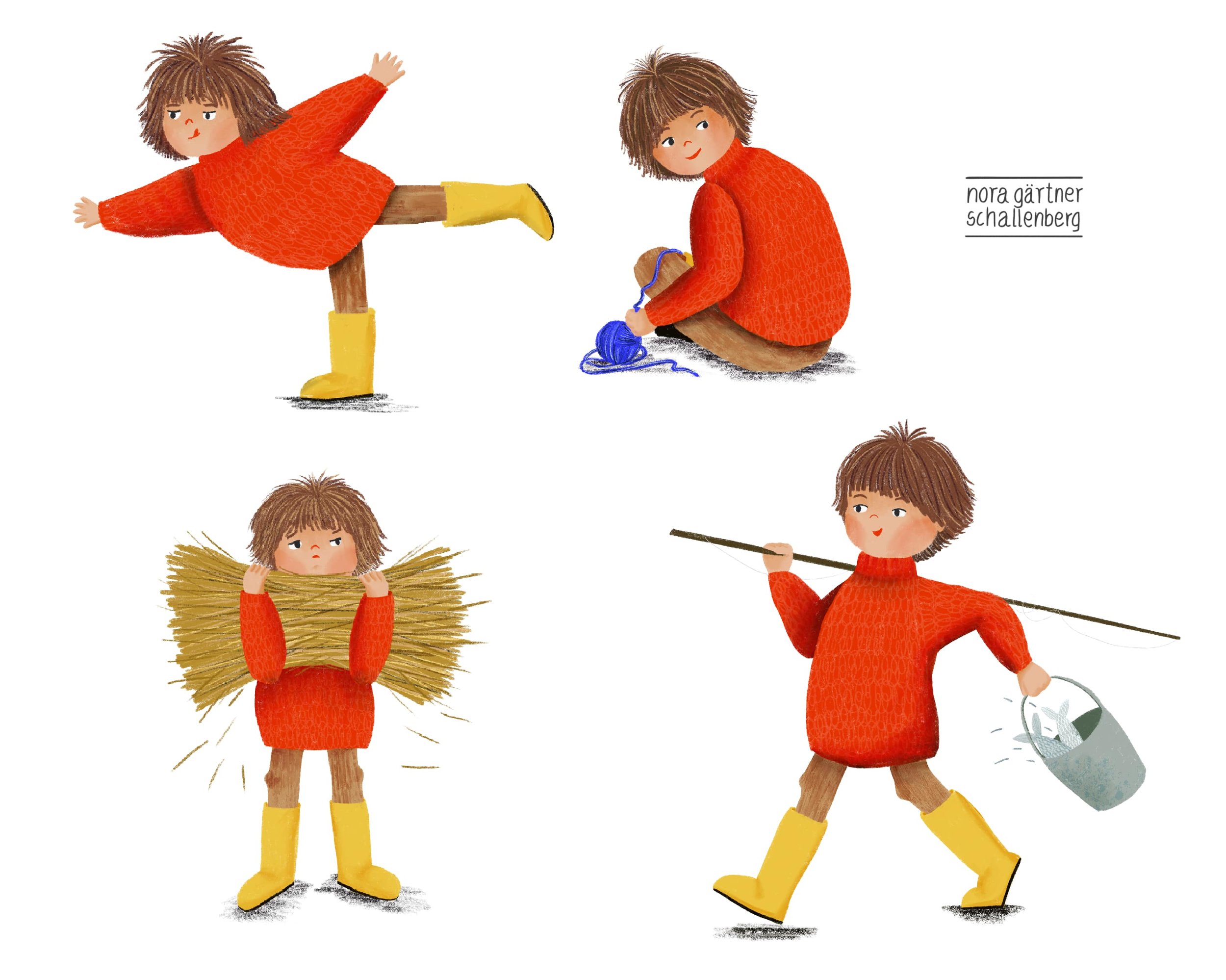
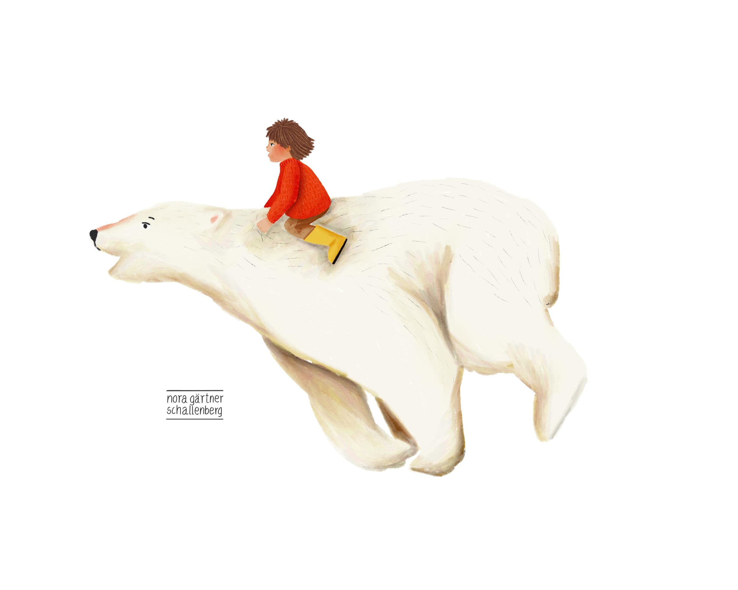
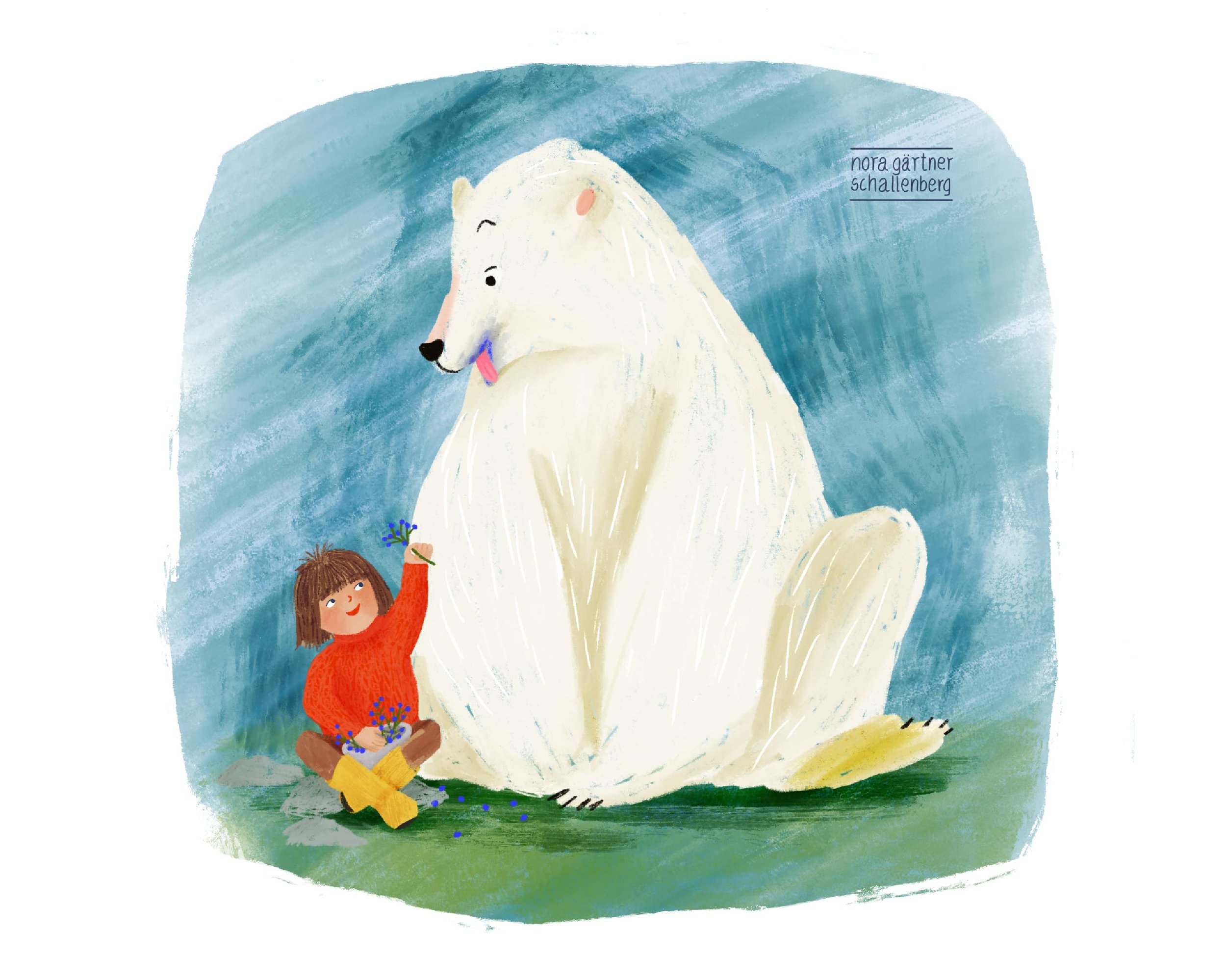
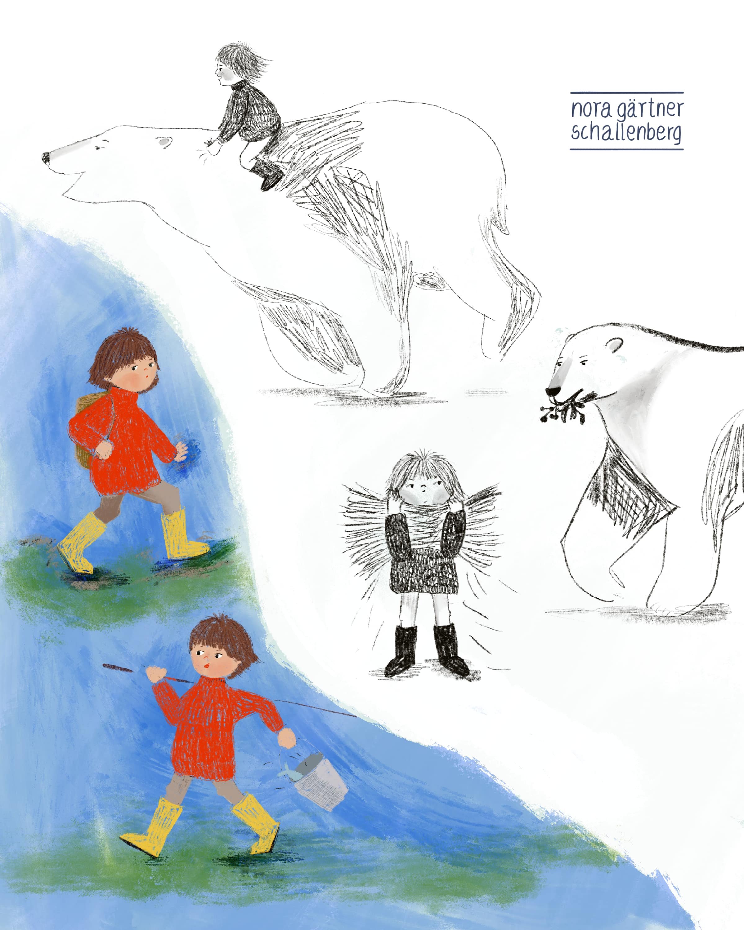
After we finished week 5, I fell in a bit of a hole, and I wasn’t really eager to paint or do anything creative. I had poured so much into those five weeks, and learned so much more than I could have imagined. I just was over saturated and happy to do something else for a while. After some time, I went back to all my pieces from the course and started reworking them, trying to incorporate everything I’ve learned. I was pretty happy with the turnout and I think they look great in my portfolio.

This course was perfect to learn about the world of children’s book illustration and to develop my skills. Some of the key points I learned during those five weeks were:
I need to trust myself more and be confident in what I draw
I have to take more time to sketch and develop the matter
There are so many different styles and ways to draw for children
It helps to try and feel the emotions of the character
Analysing the story (with every detail) is very important
If you ever want to do a course about illustrating children’s books, I can highly recommend this one. Also check out any other course they offer at makeartthatsells.com. I am in no way endorsed by them, I just think they make brilliant and fun courses where you can learn a lot and work on your skills, you meet lovely people and can make great connections.